
Ugliest Card of All Time? The 1933 Eclipse Babe Ruth has a solid case.

I wrote a while back about my disdain for the 1934 Jimmie Foxx card. But while I don’t think that’s a great card, it’s far from hideous from an aesthetics standpoint.
One of my least favorite cards is the awful looking E95 Philadelphia Caramel card of Art Devlin. But that card’s biggest crime is the horrendously bad pose.
Ugly, though? The prize for flat out ugliest card might go to the Babe Ruth 1933 Eclipse card.
You might not be familiar with this set. Even a lot of pre-war collectors don’t likely know it to well. The 1933 Eclipse set was cataloged by Jefferson Burdick as R337 in the American Card Catalog. But despite being a 1930s gum issue (those are often relatively easy to find), it’s sort of a rare set as you don’t see a ton of them compared to things like the Goudeys. These were actually strip cards and couldn’t have been produced anywhere near in the volume that Goudeys were.
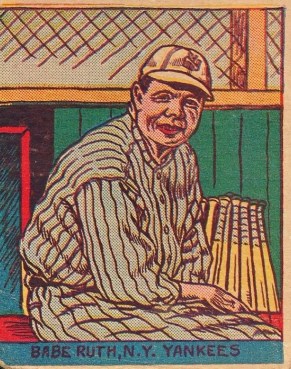 So, the Ruth card. Oh, that glorious Ruth. Well, here it is.
Look, I’ve never purported to be the greatest artist or even a decent one. In fact, if I were tasked with trying to draw an image of Ruth, given all the time in the world, I probably wouldn’t be able to do this well.
Problem is, though, I’m not designing baseball cards.
So, first. I mean, you’ve got the face. Guess what? I can sort of see a resemblance there. I mean, it’s not a good rendition but can you sell me that that’s the Babe? I won’t lie – maybe a little. That doesn’t mean it’s a great picture, though.
And what’s up with that uniform. It looks more like Babe was draped in a pair of cheap pajamas than something he would play ball in. The pants are particularly disturbing. You can’t even make out two legs down there. Babe’s hand also looks as thin as that of an old woman. His body looks oversized and the hand looks like one that would belong to someone well south of 200 pounds. What is this garbage?
Finally, what’s the deal with the NY logo? The hat does, indeed, have the Yankees’ famous crossed logo. But it’s sketched so horribly that it looks almost as if this wasn’t a licensed product and they intentionally scrubbed the logo to avoid a lawsuit.
I think part of my hatred for this awful card is its high price tag. As I said, Eclipse cards aren’t easy to find. Think you’re getting this card at a bargain? Think again. Even low-grade examples of it are usually over $1,000. Something half-decent looking can be a few grand. Can you imagine working on this set only to have to plunk down that kind of money for this hot mess?
Some cards, truth be told, are pretty hideous. If you look to some of the other strip card sets, it’s clear that much money couldn’t possibly have been spent on the artwork. Either that, or the companies that received the pictures got kind of a raw deal. But, again, this was a 1930s issue when cards were significantly more advanced. Sets like the 1930s Goudey cards, the Diamond Stars set, etc. run circles around this.
Consider, too, that this isn’t some scrub up for a cup of coffee in the big leagues. It’s Babe freaking Ruth. How do you let this be the artwork for the biggest name in baseball history?
There have to be similarly bad cards out there. Some of Ruth’s strip cards aren’t pretty. But, man, this one might take the cake.
Follow Pre-War Cards on Twitter and also be sure to like our page on Facebook.